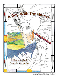
Now that Kickapoo Colors (new edition is Nature's Colors) and A Day With the Horses have left home and are being enjoyed by so many people around the world (Australia, Germany, US, Canada!) I'm hearing from people with interesting questions I'd never thought of while making the drawings.
One question several people have asked, in different ways, is how to choose colors. My illustrations are hand drawn from real life plants, animals and places, and maybe that leads the 'colorist' to think about coherent color combinations or planning color schemes rather than using any color anywhere on the picture. Which of course is just fine to do and often looks wonderful. But the question can lead to trying new ways to color and also learning how to use color for specific effects.
Color schemes will influence mood. If you color to reduce tension or stress, think about how the colors you use may affect how you feel. This can be very subjective, so always trust your feelings but some general responses to colors are common to most of us. Bright, warm colors tend to bring energy up. Red, yellow, orange feel warm to look at and can increase anger or tension but also bring up energy if you need a boost from a low spot in life. Cool colors-the blues, greens, purples- tend to calm and cause cooler feelings. However, an interesting fact is that pink is the most calming color. It is used in prison and institutions on walls for this reason. I have personally seen this work. I was managing the renovation of a clinic and had the walls painted a soft pink, to the painter's consternation. However, over the two years I used the clinic, only one person noticed the color of the walls but many people, including executives who toured the facility, commented on how "relaxing and comfortable" the office felt. I repeated the experiment in a charter school for high school students. Again the construction workers and painters were shaking their heads about the color choices! But over the years the teachers felt the pink color did have an effect on the general mood in the rooms.

I am especially fond of colored pencils for the variety of techniques they can produce and the detail possible. However some people use markers and other media very expressively. More on coloring materials later.
Try them all! Here are a few ideas about setting up color schemes for a coloring book picture. Try each one and see what ones work best for you.
Dark colors lower any energy of a color. Too much dark is usually not inviting. Be aware that there is much more light in a night scene than we think. Remember Van Gogh's 'Starry Night' painting?
http://www.moma.org/learn/moma_learning/vincent-van-gogh-the-starry-night-1889 Look at it again to see the colors he used to great effect. In 'A Day With the Horses' one picture is of the horses in a field under the starry sky. This can be very effectively colored with middle value colors if they are all similar. Use blues, grays, and gray-green, blue-green, etc. to give a night time feel to the picture.
Now, here are a few specific ways to choose colors:
Look at paintings you like for color combination ideas. It could be any subject and even any style of painting. Abstract or realistic, modern or a great master's work; the same type of flower or animal but maybe even a fantasy picture would do. What you're looking for are color combinations that make you happy to look at. Pinterest art boards,
https://www.pinterest.com/asari1036/western-art/ or artists' websites, or best yet, go to the art museum or gallery and look at real paintings.
A note on the pictures on my pinterest link: each is of rock cliffs, out west. Yet notice how different each one looks and feels. Try to choose the colors each artist chose; this helps you learn to see the colors.
Pay attention to the pictures that you like best. Use the colors you are going to color with and make the closest copy of the painting's colors that you can. Choose 3-6 colors from the painting, no more. Use them to color your picture. When you need more colors, use colors close to those already chosen. See what happens!
Use real photos of the same subject in the coloring book page. Try to replicate the real life colors. Again, use the markers or pencils you will use in the coloring book to make close copies of the photo's colors. Follow the same procedure used above.
Use a color wheel. This site has a very fun tool for choosing a range of colors that make a coherent combination in a picture; play with the color gamut tool to find your own color combinations.
http://www.livepaintinglessons.com/gamutmask.php This gives a coherent combination of colors and it is infinitely adjustable.
When you finish a page from A Day With the Horses or Nature's Colors, send it in and I'll post it. The diversity of styles and techniques is inspiring to see, and helps others try new ways to color. Thanks for sharing and have a happy day coloring!
Susan


